One of the first few things people see when they visit your social media profiles is your cover photo.
Whether it’s your Facebook Page, LinkedIn Company Page, or YouTube channel, your cover photo is the biggest image on the page. And people will see your cover photo even before they see any of your posts.
So how do you make your cover photo show up the exact way you want it to be?
One of the key factors is the size. Without the correct dimensions (width and height), your cover photo might be cropped to fit the space available and people will miss the important details on your photo.
While there isn’t a one-size-fits-all cover photo size for all the social media platforms, the information is out there.
We’ve collected all the answers here so that you can have a single point of reference for all cover photo sizes.
The best cover photo size for all major social media platform
Some social media platforms display cover photos slightly different on the desktop and on mobile. But in general, here are the ideal cover photo sizes for the platforms with a cover photo.
(Feel free to click on a social media platform to see more details for that particular platform.)
Facebook – 851px x 315px (Profile, Page, and Group), 1200px by 628px (Event)
LinkedIn – 1584px x 396px (Profile), 1128px x 191px (Company Page)
YouTube – 2560px x 1440px
Twitter – 1,500px x 500px

Ideal cover photo size for Facebook
Facebook profile and Page cover photo – 851px x 315px
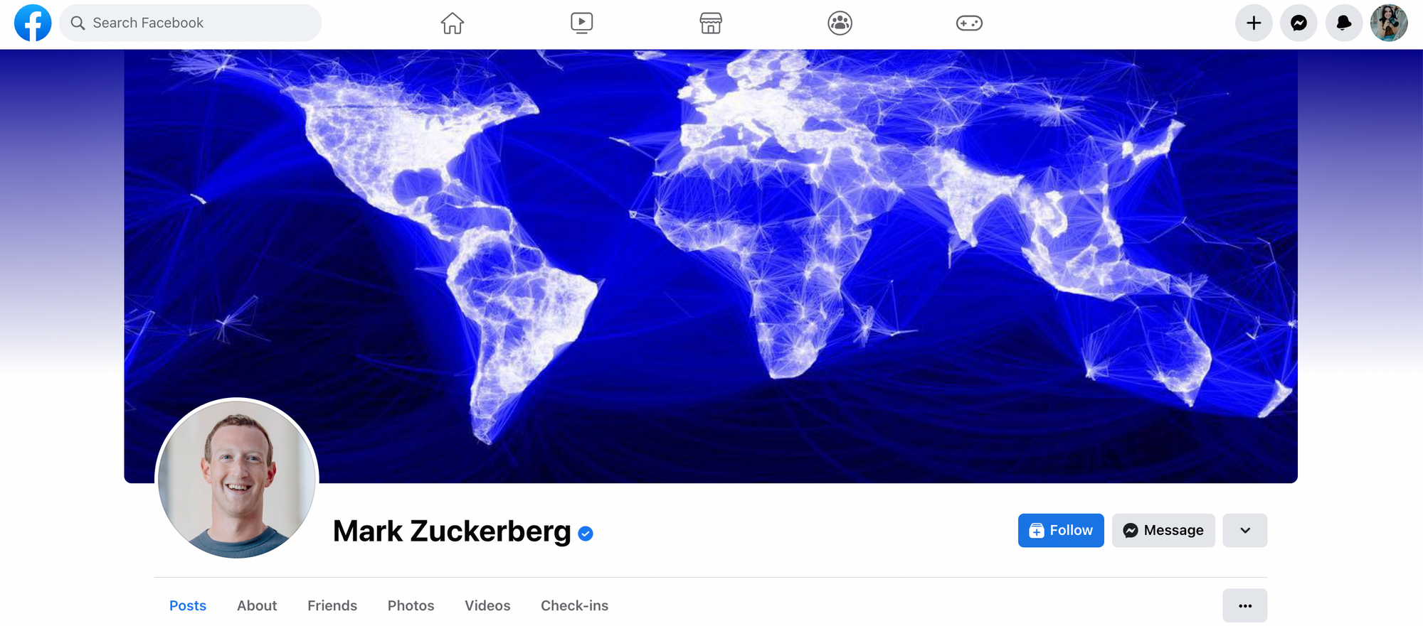
The ideal size for your Facebook (personal) profile cover photo is 851 pixels wide by 315 pixels tall. According to Facebook, your cover photo has to be at least 720 pixels wide.
There are five important details to take note of when creating a cover photo for your Facebook profile:
1. Your cover photo will look slightly different on mobile.
On mobile, Facebook shows your cover photo at a different dimension — 640 pixels wide by 360 pixels tall. Facebook will either show more of your image if your image is tall enough or crop the sides away.
From my tests, 820 pixels wide by 462 pixels tall is an ideal size for both desktop and mobile. Facebook will show the blue section on the desktop and both the green and blue sections on mobile.
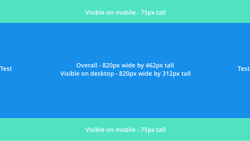
2. You can reposition your cover photo on the desktop.
In case you have any important details at the top or bottom of your cover photo and you worry that Facebook will crop them away on the desktop, Facebook allows you to reposition your cover photo by dragging it up or down.
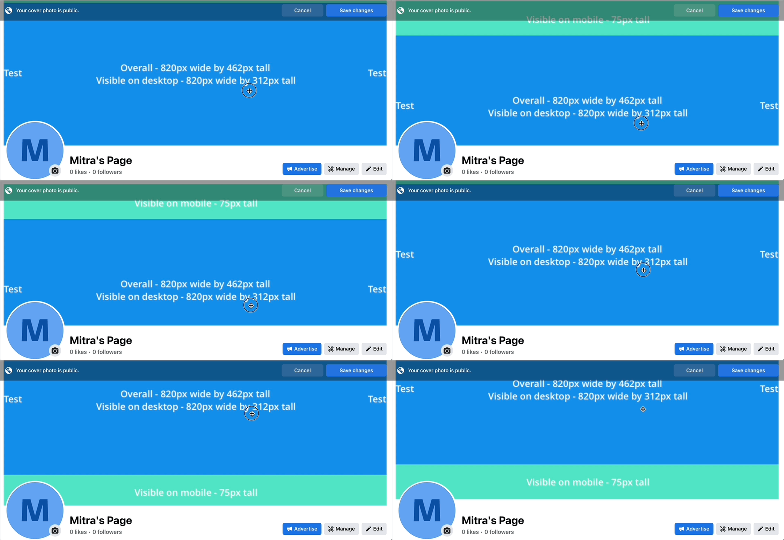
3. Your profile photo, your name, and a few buttons overlay your cover photo.
As you might have noticed in the example above, several things overlay the cover photo. You might want to take this into consideration when choosing or creating your cover photo. On mobile, your profile photo will overlay your cover photo in the middle.
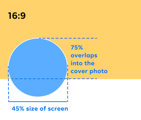
A good rule-of-thumb is to avoid having any important details in the lower half of your cover photo that might be hidden behind your profile photo.
4. Facebook shows only about half of your cover photo when someone lands on your profile.
When someone navigates to your Facebook profile, Facebook would not show your entire cover photo immediately. They have to scroll up a little to see the full image.
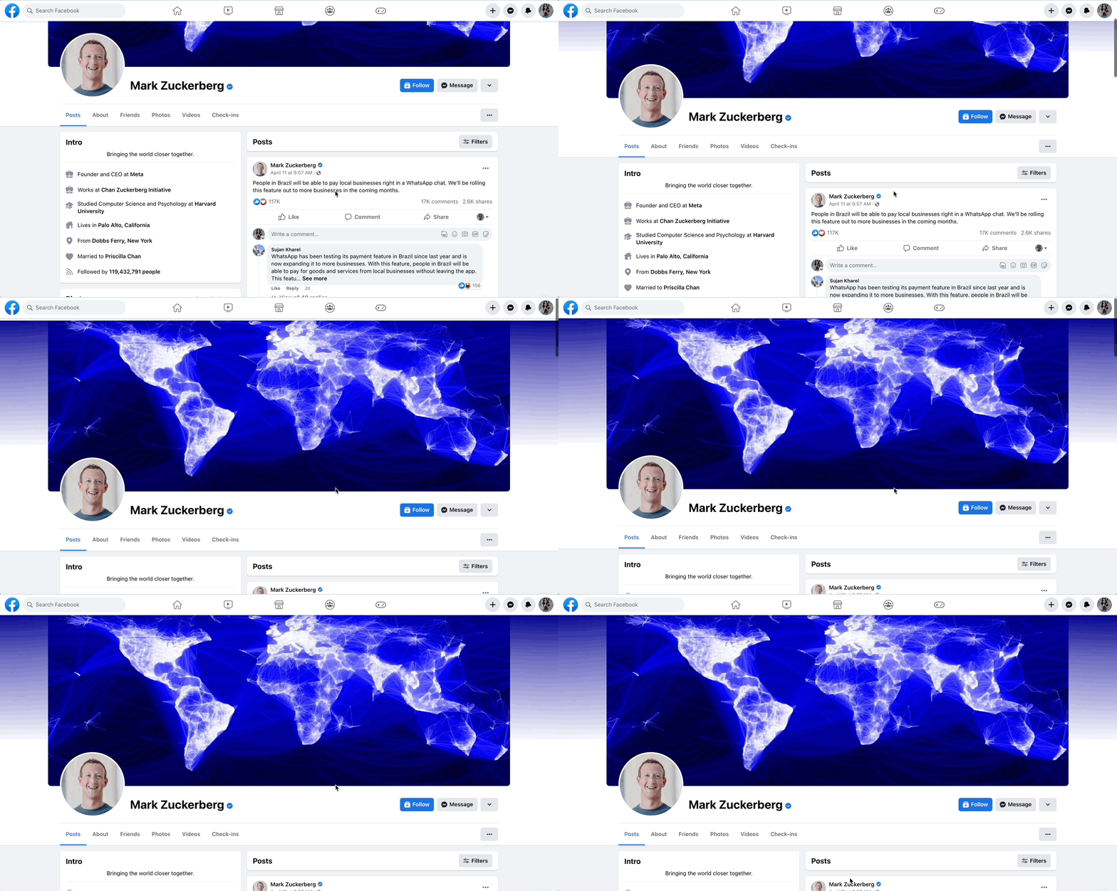
To encourage people to scroll up and check out your full cover photo, you might want to have something attractive enough in the bottom-half of your cover photo.
5. According to Facebook, if your cover photo has your logo or text, your logo or text might show up better when you use a PNG file.
Facebook Group cover photo – 820px x 462px
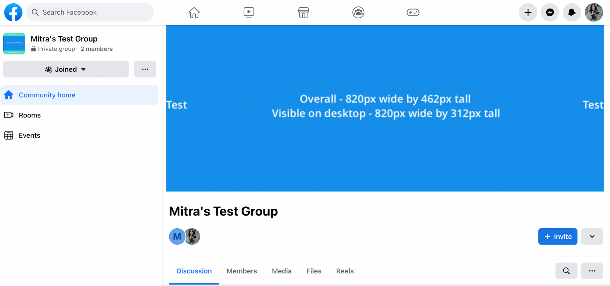
The Facebook Group cover photo is almost identical to the Facebook Page cover photo — just at a higher resolution.
The ideal cover photo size is 1,640 pixels wide by 856 pixels tall (or 1.91:1 ratio). But the area visible on the desktop is 820 pixels wide by 312 pixels tall (same as the Facebook Page cover photo). Your photo has to be at least 400 pixels wide and 150 pixels tall, according to Facebook.
Another thing you might want to think about is how your cover photo shows up in the Groups section of the Facebook mobile app.
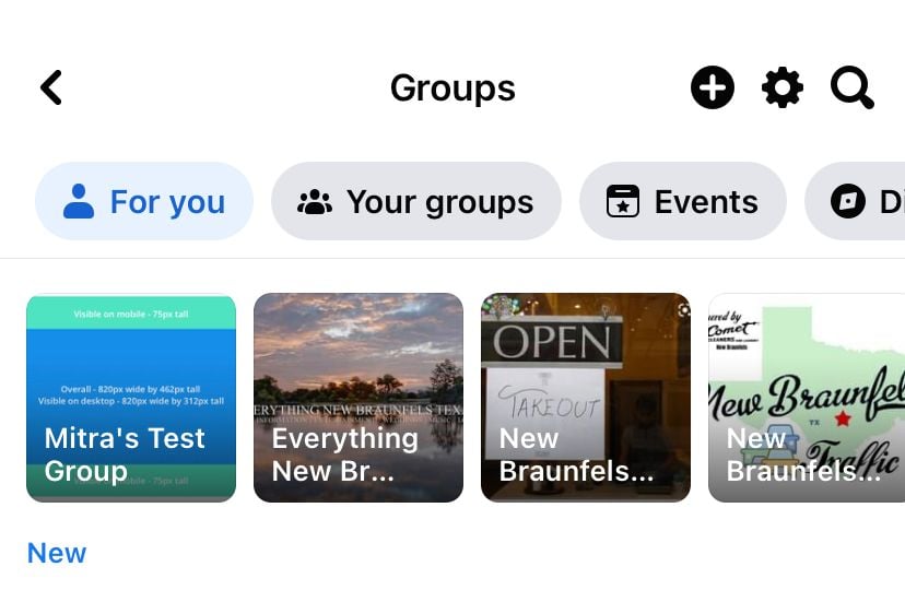
It’s best to have your copy in the center of your cover photo for the copy to show up nicely.
Facebook event photo – 1200px by 628px
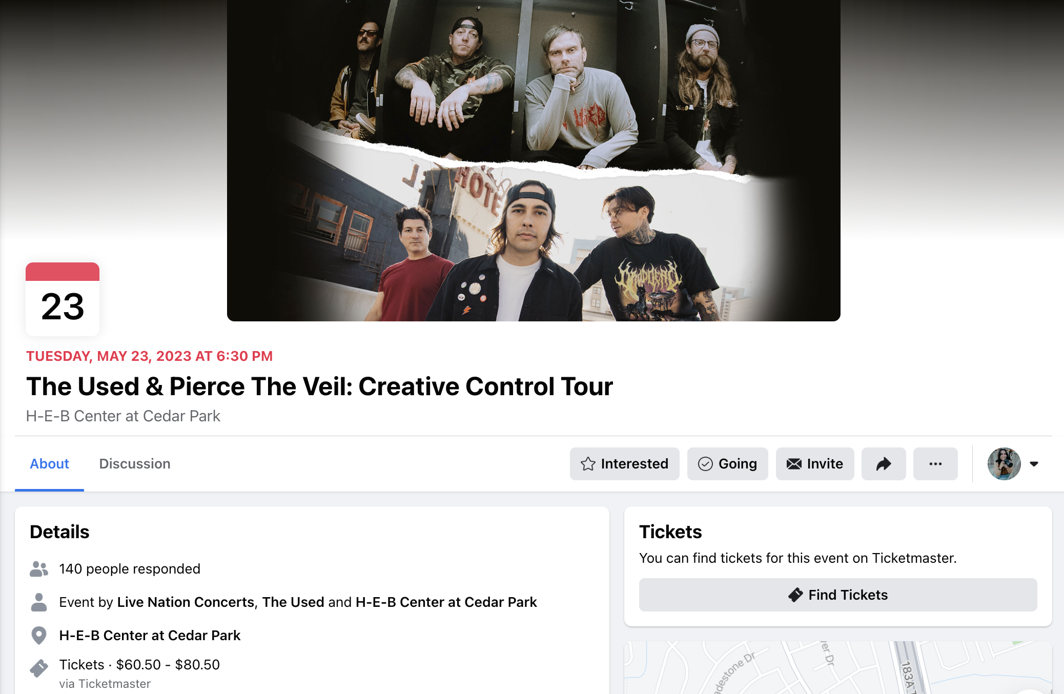
The recommended size for the event photo, according to Facebook, is 1200 pixels wide by 628 pixels tall.
For a public event, anyone who views the event can see the event photo. For a private event, only people who are invited to the event can see the event photo.

Ideal cover photo size for LinkedIn
LinkedIn profile background photo – 1584px x 396px

1. The ideal aspect ratio is 4:1.
Your LinkedIn profile background photo is displayed at a 4:1 aspect ratio. LinkedIn recommends using photos that are 1584 pixels wide and 396 pixels tall.
If your background photo looks blurry after uploading, LinkedIn has some suggestions for you:
If your background image appears blurry or pixelated, please choose an image with a file size. Photos will also look better than images with logos. If your image is still blurry or pixelated, you may want to run it through a compression tool such as Trimage for Windows or ImageOptim for Mac before uploading it to LinkedIn.
2. Your profile photo will cover your background photo a little on mobile.
In its mobile app, your profile photo covers a different section of your background photo, as seen in the screenshot below.

LinkedIn Company Page cover photo – 1128px x 191px
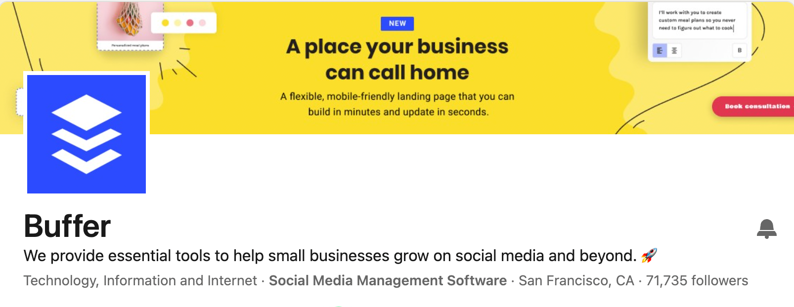
1. Your profile photo will cover a small section of your cover photo.
While LinkedIn recommends the dimensions of 1128 pixels wide by 191 pixels tall, your profile photo covers a small section on the left, so it might be best to keep the important aspects of your photo to the middle of the photo if possible.
(The minimum dimensions required by LinkedIn is 1128 pixels tall by 191 pixels wide.)
2. Your profile photo covers a little more of your cover photo on mobile.
Keep this in mind when uploading your cover photo.


Ideal channel banner size for YouTube
2560px x 1440px

1. Your channel banner looks differently on the desktop, mobile, and TV.
The cover photo for your YouTube channel is known as the channel art.
Because YouTube can be viewed on a desktop, mobile, and even TV, your channel art will be displayed differently on different devices. The ideal dimensions that YouTube recommends are 2560 pixels wide by 1440 pixels tall.
Here are a few more details to take note of:
- Minimum dimension for upload: 2048 x 1152 px.
- Minimum safe area for text and logos: 1546 x 423 px. Larger images may get cropped on certain views or devices.
- Maximum width: 2560 x 423 px. This means that the “safe area” is always visible regardless of screen size. The areas to each side of the channel art are visible or cropped depending on browser size.
- File size: 6MB or smaller.
TubeSkills has created an awesome channel art template that you can use to see how your channel art will look like on various devices.
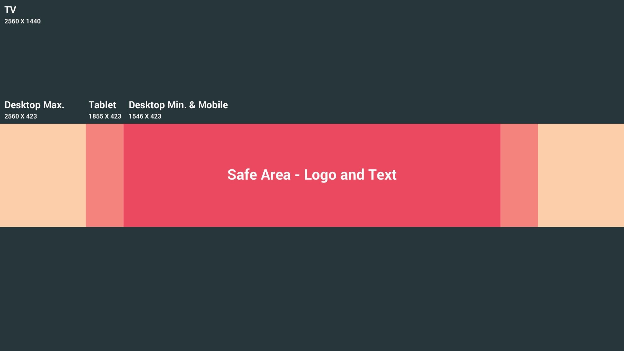
The template comes in a Photoshop file so you can overlay it on your image to get a sense of how your image will be cropped and displayed. Here’s an example:
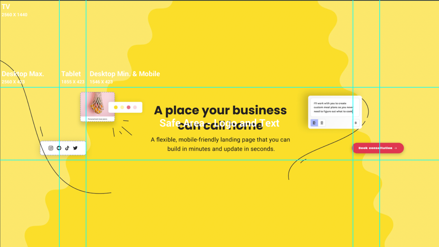
2. Be mindful of your channel links.
When you are creating your channel art, you might want to avoid having any important details in the lower-right corner of your channel art.
That’s because your channel links will be placed on top of your channel art when viewed on the desktop and mobile.
Here’s how your channel art will look like on the desktop and mobile with your profile image:


For tips on optimizing your YouTube channel, you might like our guide on creating a YouTube channel.

Ideal header photo size for Twitter
1500px x 500px
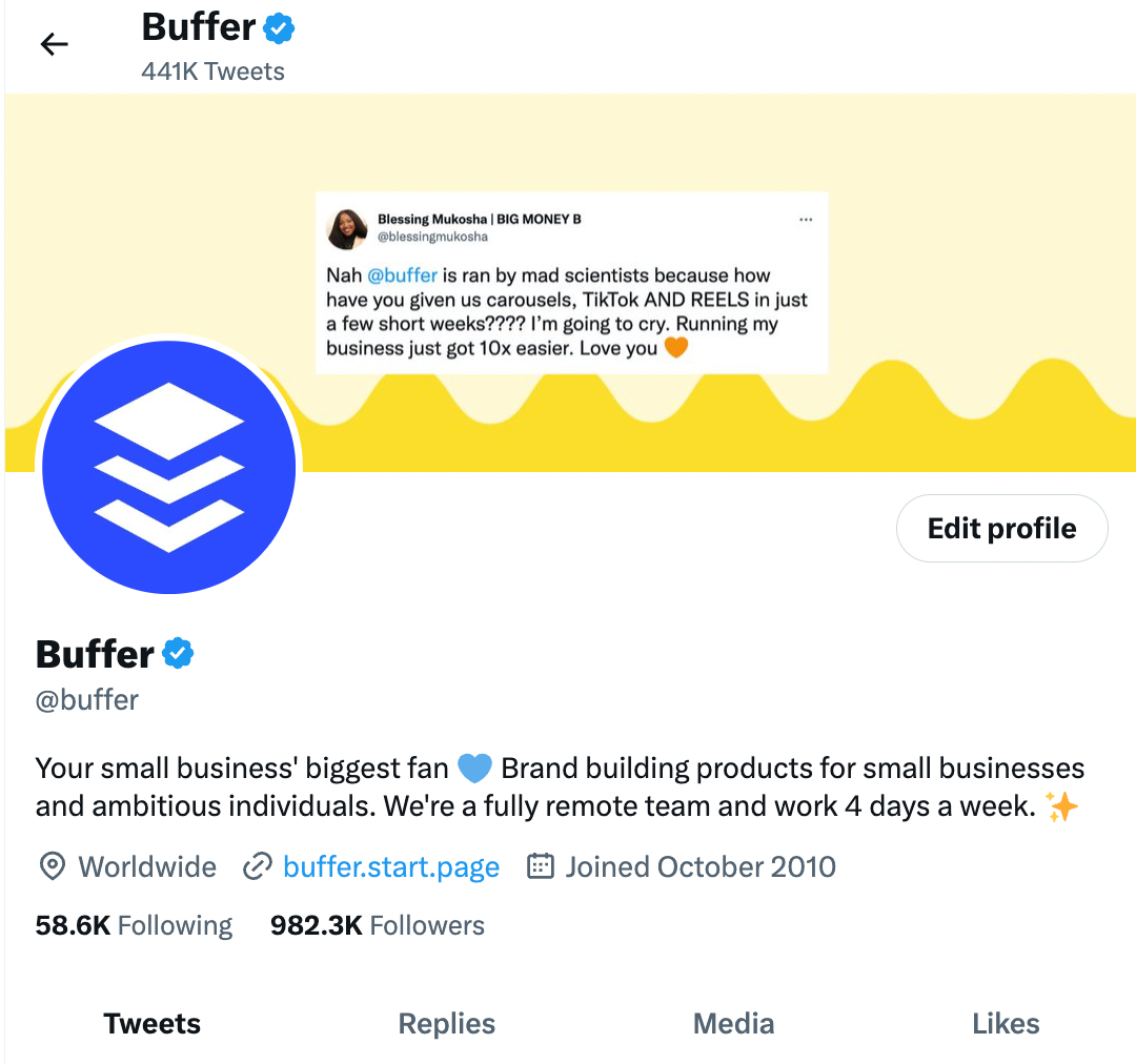
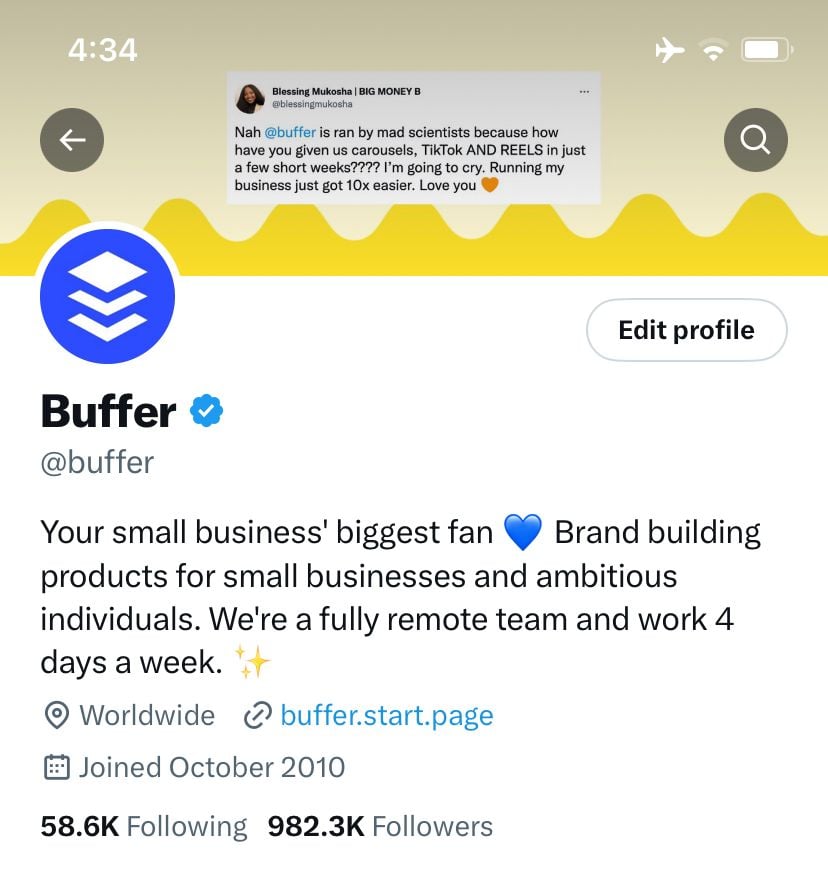
Twitter recommends that your header photo be 1500 pixels wide by 500 pixels tall — much wider than it is tall, compared to most cover photos.
It’ll be great to use an image that is wide enough to prevent Twitter from stretching the image and making it blurry.
1. Your profile photo overlays your header photo.
Just like your Facebook profile, your Twitter profile photo will cover a tiny part of your header photo. It’s great to be mindful of this so that your profile photo doesn’t cover anything important in your header photo.
2. Twitter allows you to reposition and scale your image.
Something nice about Twitter’s header photo is that Twitter allows you to reposition and scale the photo you uploaded to your liking.

Over to you
I hope you found this resource useful for creating the perfect cover photo for your social media profiles.
Do you have any tips and tricks for creating cover photos?
—
Image credit: Unsplash, Mark Zuckerberg’s Facebook profile, The Late Show With Stephen Colbert YouTube channel


