Here’s a riddle: When is a tweet more than a tweet?
We’re all pretty familiar with Twitter’s 140 characters—and of course, a photo is always an eye-catching addition. But what if your Twitter audience could sign up for your email list without ever leaving Twitter, or directly download your new app straight from a tweet? What if a photo and article summary could travel alongside every post of your content?
And what if you could do all of this for free, right now?
Twitter cards offer all this potential and more. In this post, we’ll go over everything a marketer or small business owner needs to know about Twitter cards—how to understand which types are best for you, how to set up and verify your cards, how to analyze and measure your cards and a few caveats and best practices to know to make sure your Twitter cards stand out from the crowd.
Let’s get going!
Exclusive Bonus: Download a free Twitter Cards cheat sheet!
What are Twitter cards?
If you’ve ever watched a Vine, viewed a YouTube video or clicked on a photo with your Twitter stream, you’ve already come into contact with a Twitter card.
Twitter’s card infrastructure is what allows us to have these rich media experiences that go far beyond a 140-character written message right within Twitter.
By adding a few lines of HTML to your webpage (don’t worry, we’ll cover that; it’s probably easier than you think), you can create this experience for your audience, too.
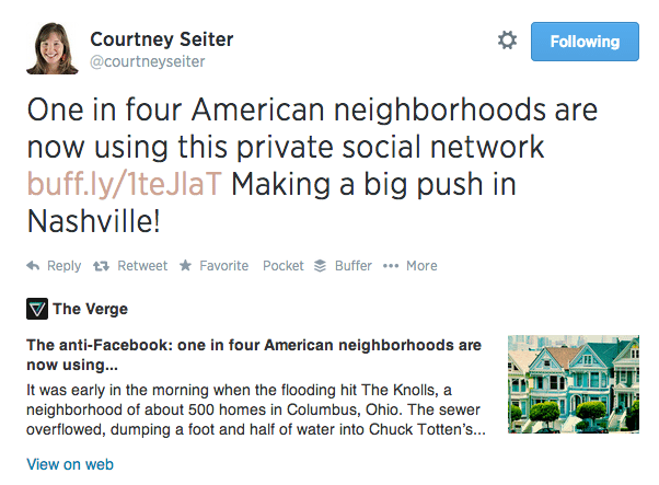
Any users who Tweet links to your content will have a “card” added to the tweet that’s visible to all of their followers. For instance, here’s how The Verge’s Twitter card carried its information right into my Twitter stream when I shared a recent article there.
With four different card types to choose from, you can use Twitter cards to ask your audience to do things like:
- View an image
- Watch a video
- Visit a landing page
- Download an app
…without them ever having to leave Twitter. You’ll also get added benefits, like:
- A consistent look for your posts across platforms (anyone who shares content that has Twitter cards code in place will produce the same media-rich tweets)
- Consistent attribution that could drive more traffic to your site and increase the number of people following you
- Custom titles and descriptions for your photo or URL (a lot of extra room above and beyond the tweet’s standard 140!), and
- A really awesome mobile experience for your audience.
Are you in yet? Good; now let’s figure out what Twitter cards are right for you.
Types of Twitter cards and their uses
Right now there are four types of Twitter cards that cover a lot of different ground for different types of Twitter publishers as well as different marketing goals. Here’s a quick rundown of each type with an example of how that card looks in the Twitter stream.
Summary card
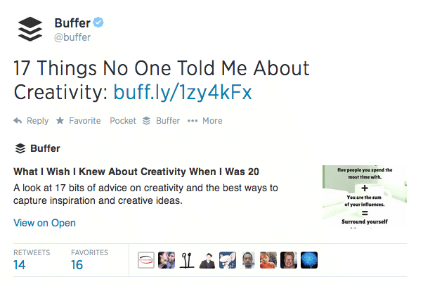
Summary cards are Twitter’s “default” card and include a title, description, thumbnail image, Twitter account attribution and a direct link to the content. These are great for blog posts!
Large photo summary card
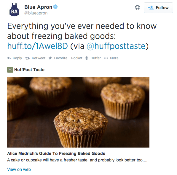
Large photo summary cards have all the same features of a regular summary card, but they trade a bit of the description space for a big, beautiful image. Highly visual content producers might want to think about this card.
Player card
If you work in music, video, or multimedia, a player card is a must. This card allows your audience to watch, listen, or click through your media without leaving Twitter. Think YouTube, SoundCloud, Vine, etc. Here’s how YouTube’s card allows users to watch a YouTube video while staying put within Twitter.

App card
For driving traffic directly to an app, the Twitter app card is ideal—particularly on mobile. When an app with cards enabled is mentioned on Twitter, this card shows the app’s
name, ratings, price and icon, along with a short description. The link takes viewers directly to the App Store to download. The call-to-action only displays in the Twitter for iPhone, iPad, and Android apps, and only when the user does not already have your app installed.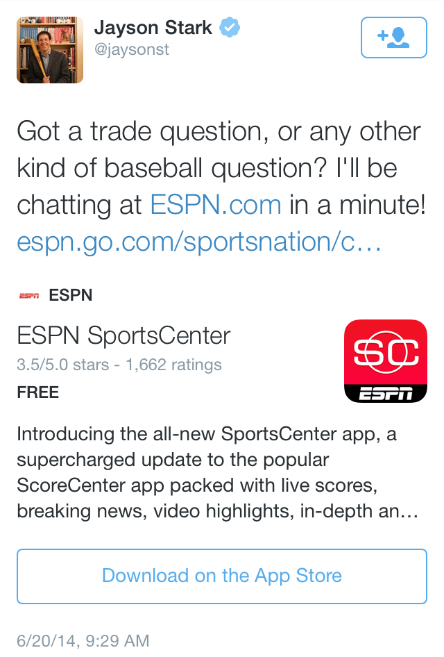
(Image from Twitter)
How to set up Twitter cards
Have you picked your favorite Twitter card options yet? Excellent; now it’s time to set them up. There are a few different ways to go about this, so we’ll do it Choose Your Own Adventure style. (Note: For website and lead generation cards, it’s simple: Just go to the Twitter Ads Dashboard to make them).
If you’re a developer (or are buddies with a developer)
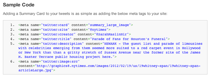
For maximum control and flexibility over your Twitter cards, you can add the appropriate meta tags for the card of your choice onto your site. Twitter offers some nice documentation on how to do this, with the code all set for you to plug your information into. Here’s a sample of their code for a summary card.
If you’re not a developer
Don’t worry if you’re not a developer or can’t wrangle one to give you a hand; there’s still quite a bit you can do on your own. Next step!
If you have a WordPress.org site
There are three different plugins you can try Twitter recommends three plugins to integrate your WordPress site with Twitter Cards: Jetpack, JM Twitter Cards and WordPress SEO by Yoast. Jetpack: Install Jetpack and navigate to the “Social” section to validate your Twitter handle and turn on Twitter cards. Jetpack automatically scans the contents of your post and determines the best card type.
- If your post has no images, the Twitter card will be set to summary
- If your post has between 1 and 4 images, the Twitter card will be set to large photo summary
- If your post has more than 4 images, the Twitter card will be set to gallery
WordPress SEO: Install WordPress SEO by Yoast and navigate to Social > Twitter, where you can choose between summary and large photo summary cards. Bonus: Yoast also helps out with Facebook Open Graph!
JM Twitter Cards: Install JM Twitter Cards and you can enable summary, large photo summary, app, and photo cards. No matter which of these plugins you use, you’ll need to wind up your process by taking a URL from your blog or website (not the main site name; a specific URL where you’d like your card to display) and running it through the Twitter Card validator. You’ll probably end up getting a message like this.
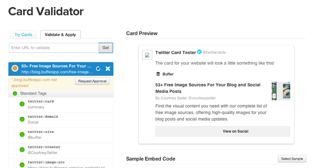
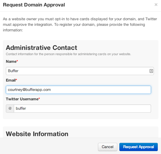
From here, click the “request approval” button, fill out the quick information the form asks for (your website, a description of your website, your Twitter handle, your email address)
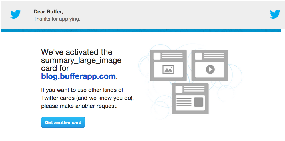
Twitter says it could take up to a few weeks to get approval, but all my tests for this post got approved almost instantly. When you’re approved, you’ll get an email that looks like this:
The next time you tweet one of your links, it should be card-ified!
If you have a WordPress.com site
By default, WordPress-hosted blogs are enabled for Twitter Cards. WordPress automatically scans the contents of your post and determines the best Card type. (You’ll still need to do the validator step, though.)
If you have a Tumblr or Blogger blog
For Tumblr, Blogger or any other kind of site, get working on befriending a developer or getting comfortable with code—adding meta tags are the way to go here (you’ll also need to validate). This also goes for more complicated cards that require a few extra steps, like the player card.
Need-to-knows and strategies for Twitter cards
So far we’ve talked about all the great things about Twitter cards, of which there are many. There are a few caveats to know, too.
1. Most cards are unexpanded, so make users want to click
First of all, your Twitter card ensures that all your extra information will travel with every post to Twitter. However, there’s no guarantee that your audience will click to see it. For instance, here’s how the Huffington Post would likely want you see their post.

But in the Twitter stream, and as it gets retweeted by fans, here’s how it looks. Only when that “view summary” text at the bottom right is clicked will users see the full Twitter card.

The default for all Twitter cards (except website and lead generation cards, which are treated a little differently) is this unexpanded version that relies on the user to click for more. The lesson here? Make your copy so compelling and intriguing that users want to click (not so different than what we’re already used to doing with Twitter, right?) One great example I came across is Etsy. Their tweets are short and sweet and do a great job of compelling the viewer to click.
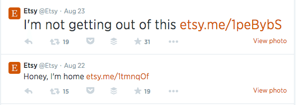
What aren’t they getting out of? Let’s find out:

Ah, got it. Looks comfy! Basically, whichever card you choose you’ll want to be aware that every word counts—in the tweet itself and in your extra space for descriptions and calls-to-action. Make your offer clear, your text compelling. You might even consider including a “click to expand” call to action in your tweet to ensure maximum visibility.
Prioritize images
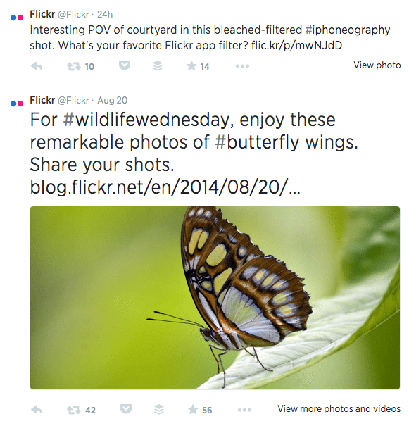
Twitter is pretty good about finding and resizing images to fit your posts, but help yourself out by devoting a little extra time to your images in posts where cards are enabled and the images you make for special cards like lead generation and website cards. Once your cards are in place it might be tempting to let them to do the work and tweet fewer photos, but keep prioritizing attached photos, too! Tweets with images attract 18% more clicks, 89% more favorites and 150% more retweets than those without them, and Twitter shows photos by default in the stream (as opposed to cards, which need to be clicked to expand). A quick glance at the metrics for these two Flickr posts shows that the photo your audience sees by default has more of an impact than the one they have to click to find.
Test your cards
With so many Twitter card options, I bet you knew we wouldn’t let you leave this post without talking about A/B testing. Try creating multiple cards for the same campaign with varying images, text and calls-to-action to see which types work best. You might even consider multiple types of cards. Depending on your content and goals, you could find that various sections of your site thrive with different card types.
Cards + pins + ads
With cards plus the ability to pin tweets to the top of your timeline, Twitter has given marketers a powerful one-two punch. We’ve had particular success at Buffer with pinning our lead generation card to the top of our Twitter stream.
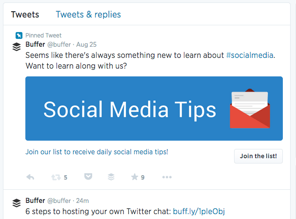
Marketers with an advertising budget cam combine lead generation or website cards with targeting options like interest, keywords, or tailored audiences segments to drive qualified traffic at just the right time
How to measure success with Twitter cards
I imagine after you’ve gone through all the effort of choosing your cards, bribing a developer and/or installing plugins, and crafting killer cards, you’d like to know how Twitter cards are performing for you. Twitter’s got you covered! Let’s take a look at some of the analytics you’ll find in your account. To see your analytics, navigate from your Twitter account to Ads:
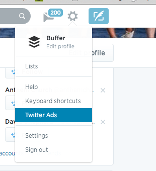
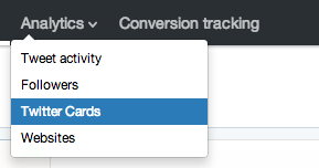
Then to Analytics > Twitter Cards:
Once there, you should see a dashboard that looks something like this:
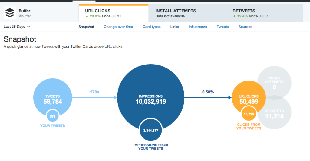
Since the information in cards travel with the tweet regardless of who’s posting, these metrics are for all Twitter users (not just your tweets). Twitter can’t count posts made through third party tools, though.
Top line metrics
These are the numbers at the very top and include: URL clicks:
The number of clicks on a URL in a tweet or a cardInstall attempts:
The number of times users who don’t already have the app installed clicked “Get the app” on a card that has app information enabledRetweets:
Retweets that occur on tweets containing a link to your contentSnapshot
The snapshot graphic is a quick look at how tweets and cards are driving traffic, installs or shares—click on the circle of the goal that interests you to see it in full.
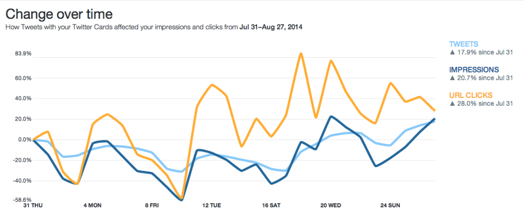
Change over time
This graph has the same impressions, tweets and clicks metrics from snapshot, but formed into a rolling 28-day look at how each metric has grown in comparison to the others.
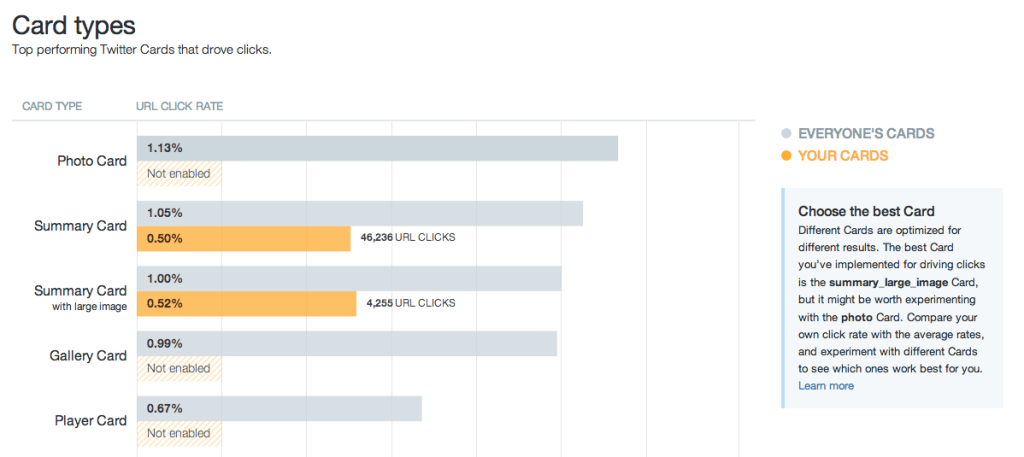
Card types
This chart allows you to benchmark your Twitter cards by comparing their performance against overall standards.
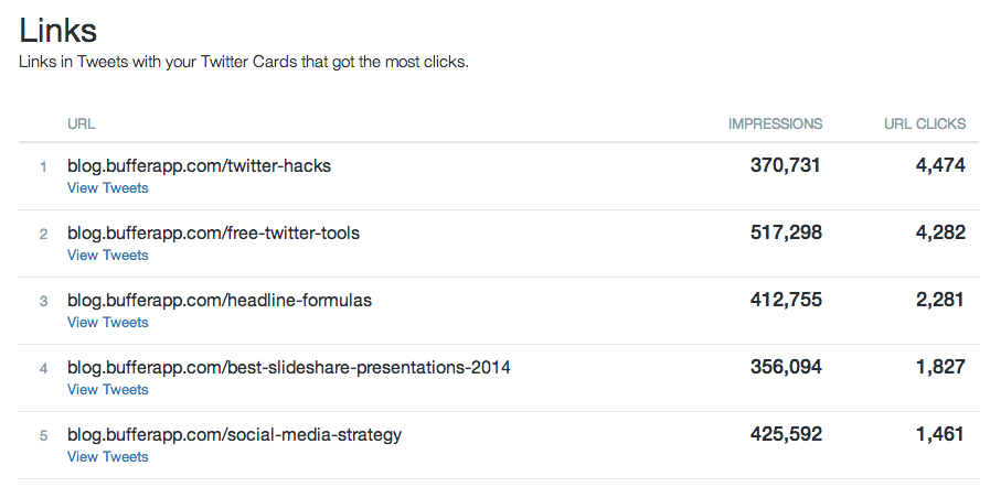
Links
See which content is faring best with this chart, which surfaces your top-performing posts by impressions and clicks (up to 100 top links).
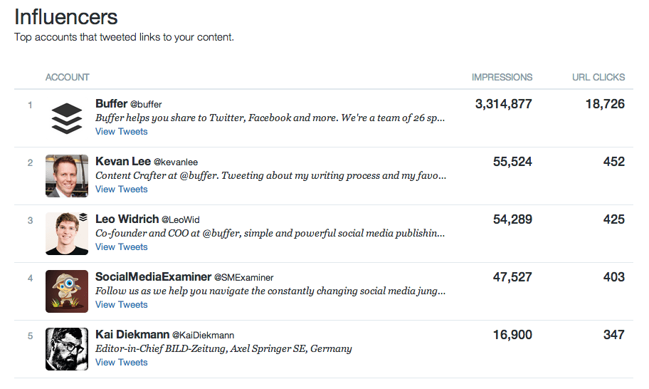
Influencers
Whose posts had the most impact on your impressions and clicks? This chart will tell you–all the way up to your top 100 influencers.
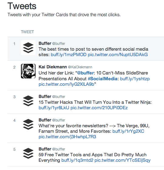
Tweets
Here’s a useful list of the top posts that drove clicks back to your site (note that they’re not necessarily coming from your account alone)
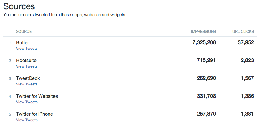
Sources
Where are all the posts that include a URL or card of yours coming from? This chart captures all the different apps, tools and widgets your audience is posting from.
Over to you
Whew! So that’s it for analytics, and everything you need to know (I hope) to get started with Twitter cards. (Got questions I didn’t touch on? Let me hear them!) Have you tried Twitter cards? I’d love to hear about your experiences with setting them up and using them, as well as how your audience has interacted with them. Tell me all about it in the comments! Exclusive Bonus: Download a free Twitter Cards cheat sheet!


